Emotive Tech
/
How Digital Interaction
Enhances Oral Care
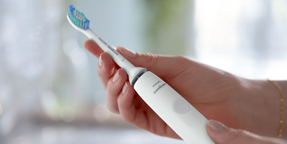
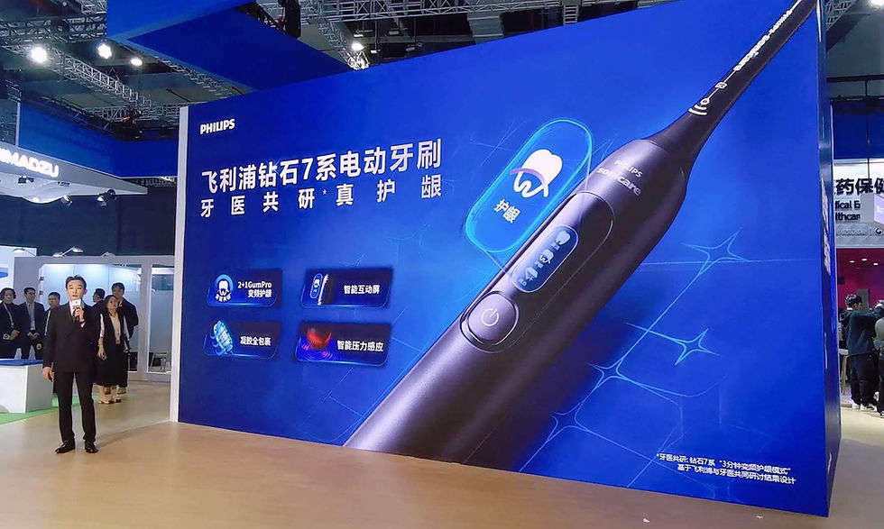
Project: Sonicare Diamond Clean Essential
Brand: Philips
Year: 2022
#DigitalExperience #SensingTech #AnimatedUI #OralHealthCare
Consumers are looking for solutions that go-beyond just brushing, which has made gum health a popular topic. Poor brushing habits, such as applying excessive pressure or not properly cleaning the teeth, are often the main causes of gum problems. This project aims to design an electronic toothbrush that provides a comprehensive and premium gum care solution to not only prevent symptoms, but also offer an advanced oral care experience in a smart way.
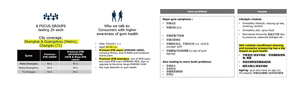
In the early stage of project, design team together with business group have conducted 6 Focus group study in Shanghai, Guangzhow and Chengdu. The goal of the focus group study is to understand the consumer pain-point and product feature expectation regarding the gum health.
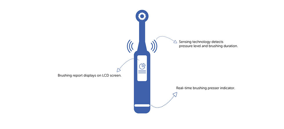
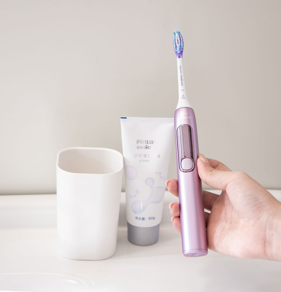
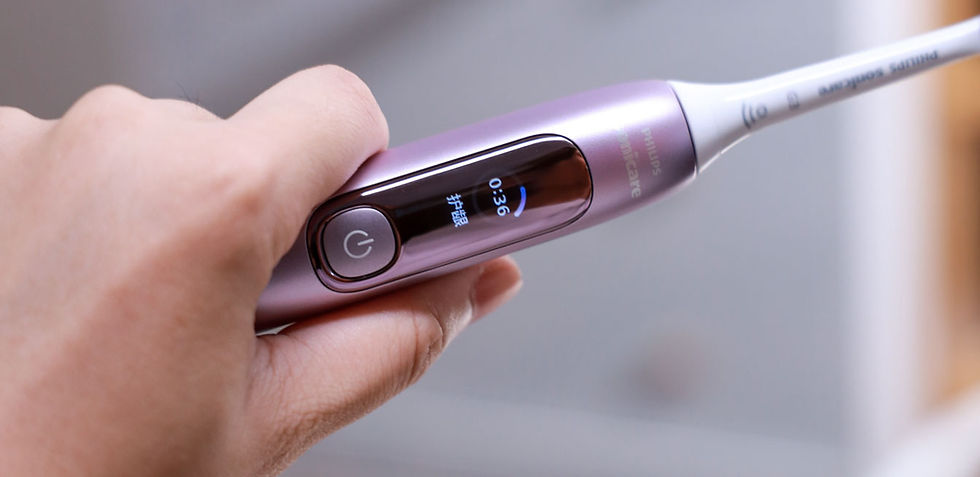
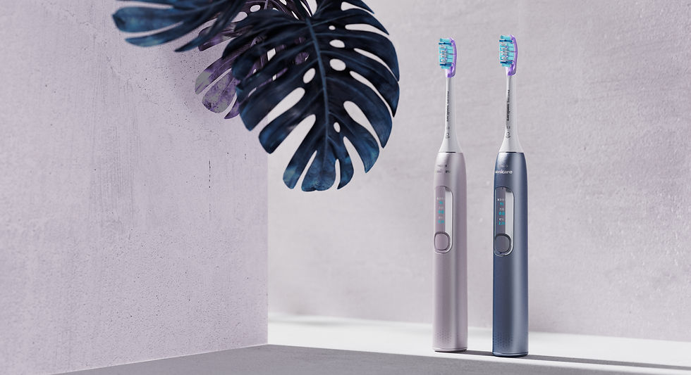
Designed with smart-sensing technology, this product detects user behaviors including pressure level and brushing duration which are collected into easy-to-understand reports or feedbacks displayed on LCD screen. Supporting by the real-time lighting indication. Brushing pressure is clearly shown to users with instant alert. It effectively prevents gum damaging due to excessive brushing pressure or inadequate cleaning because of the insufficient brushing force and furthermore improve the overall brushing experience.
Designed with smart-sensing technology, this product detects user behaviors including pressure level and brushing duration which are collected into easy-to-understand reports or feedbacks displayed on LCD screen. Supporting by the real-time lighting indication. Brushing pressure is clearly shown to users with instant alert. It effectively prevents gum damaging due to excessive brushing pressure or inadequate cleaning because of the insufficient brushing force and furthermore improve the overall brushing experience.
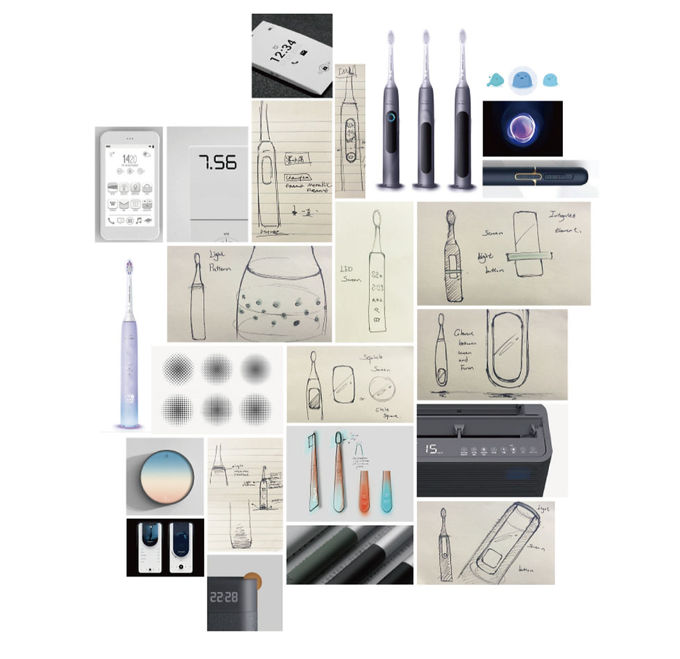
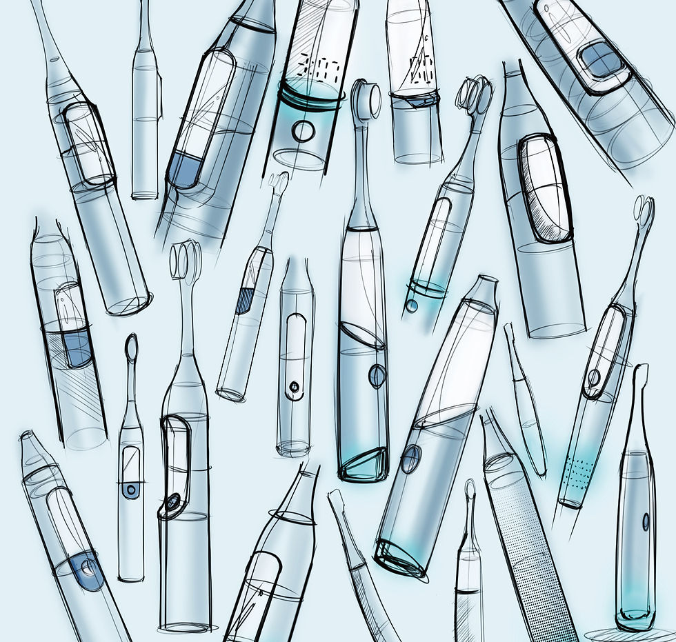
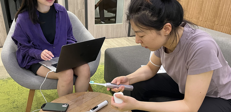
We started by gathering a group of designers for a workshop, dedicating a few hours to a brainstorming session. The goal was to explore various ways of displaying feedback on the screen and indicating pressure levels. This session was invaluable as it allowed us to generate a wide range of ideas and possibilities, which were then refined and developed into the subsequent concepts. The collaborative environment helped us push the boundaries of innovation, ensuring that the final direction was both functional and user-centric.
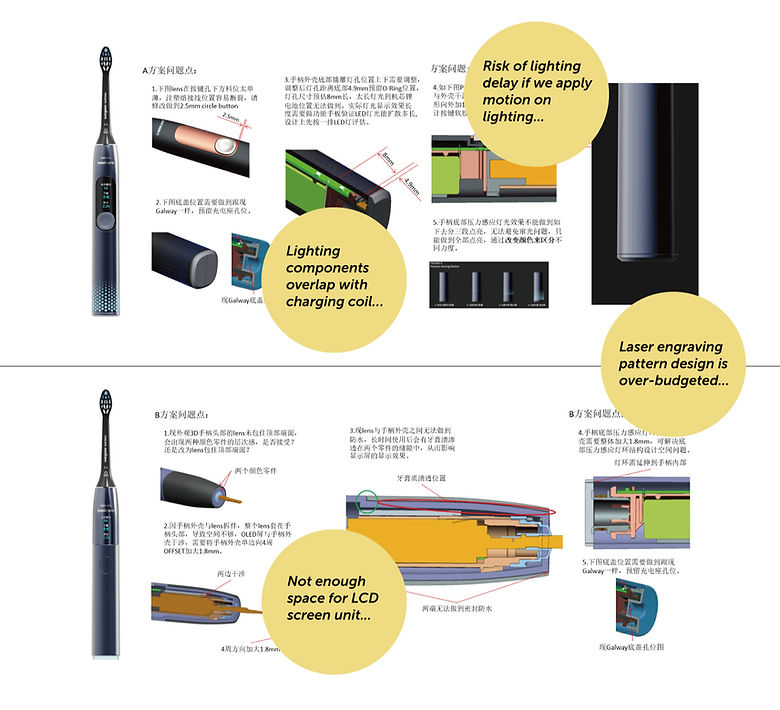
From the early stages, we involved our supplier in reviewing the feasibility of our ideas, considering factors like cost and structure. This collaboration ensured that we could align our design concepts with practical manufacturing constraints and budget expectations. By getting the supplier's input early on, we were able to refine our ideas and avoid potential roadblocks down the line, ensuring a smoother transition from concept to production.
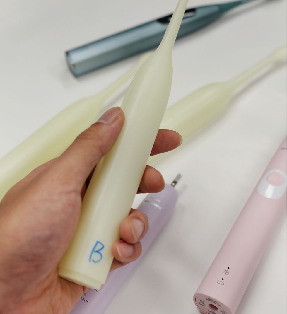
We also leveraged 3D printing to quickly review different form factors with business stakeholders, allowing them to physically experience the ergonomic feel and envision the product in real usage scenarios.
This hands-on approach helped align expectations, facilitate discussions, and ensure that the final design would meet both user needs and business objectives.
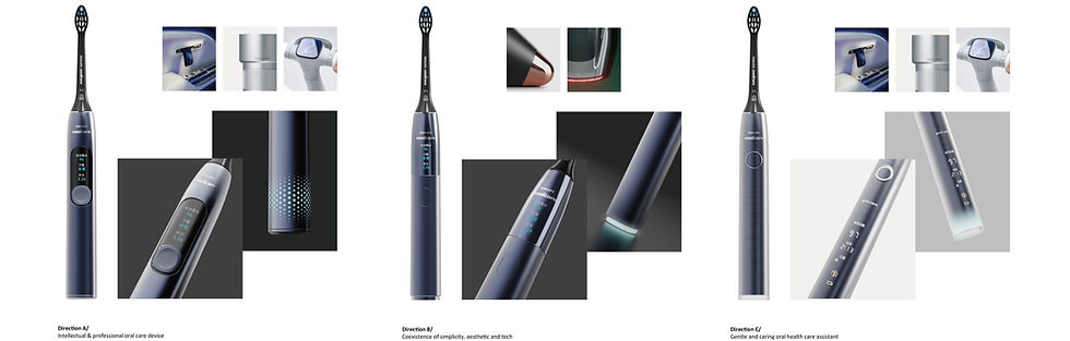
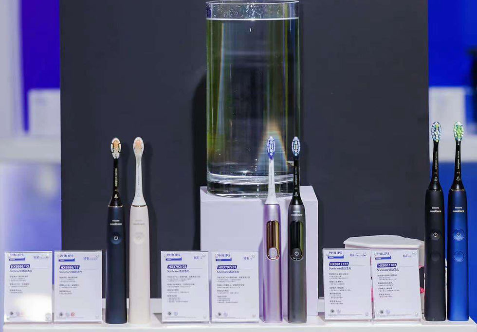
The final handle design features a streamlined curvature that embodies the balance between professionalism and elegance. This curvature is not just an aesthetic element but also serves to establish a dependable and intuitive connection between the user and the product. The squarcle shape, with its refined tension in section transitions and touchpoints, enhances both ergonomics and visual appeal. Additionally, the chamfer details on the button and base contribute to an overall sense of sophistication and precision, reinforcing the premium feel of the design.
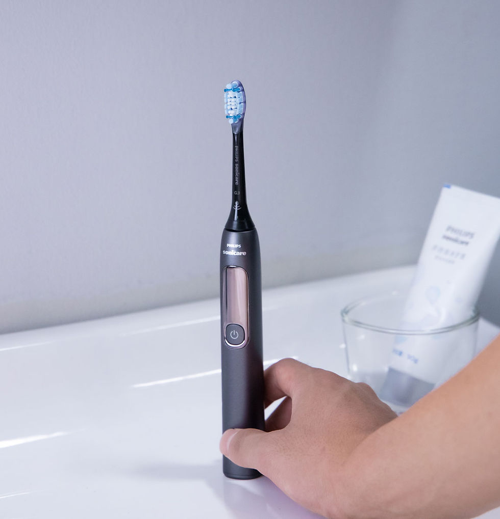
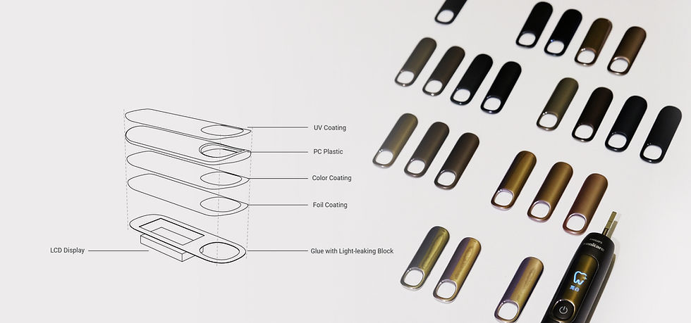
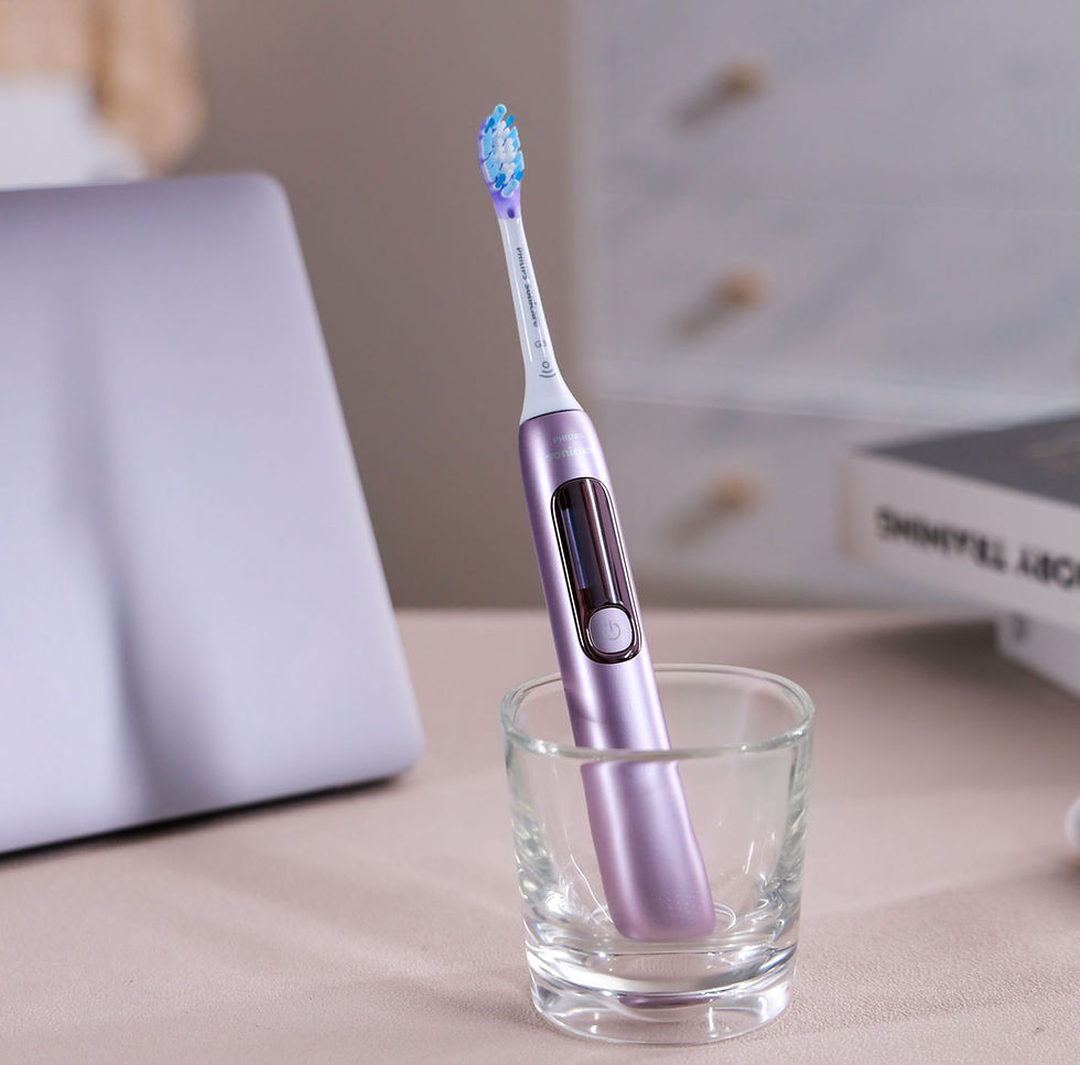
Metallic coating on the lens perfectly merges the LCD display into the brush handle instead of using the classic black lens with high contrast. With this integrated approach we aim to eliminate distance between human and technology, and to create a unique warm-tech impression following our branding manifesto.
The biggest challenge in developing the display lens coating was controlling the thickness of the foil coating. The coating’s opacity directly affects light penetration, which in turn impacts how clearly the UI is displayed. To achieve the optimal effect, we conducted multiple rounds of prototyping, testing various foil coating thicknesses and different levels of roughness on the UV coating. Each iteration helped us fine-tune the balance between opacity and light diffusion, ensuring a crisp, legible display while maintaining the premium look and feel of the product.
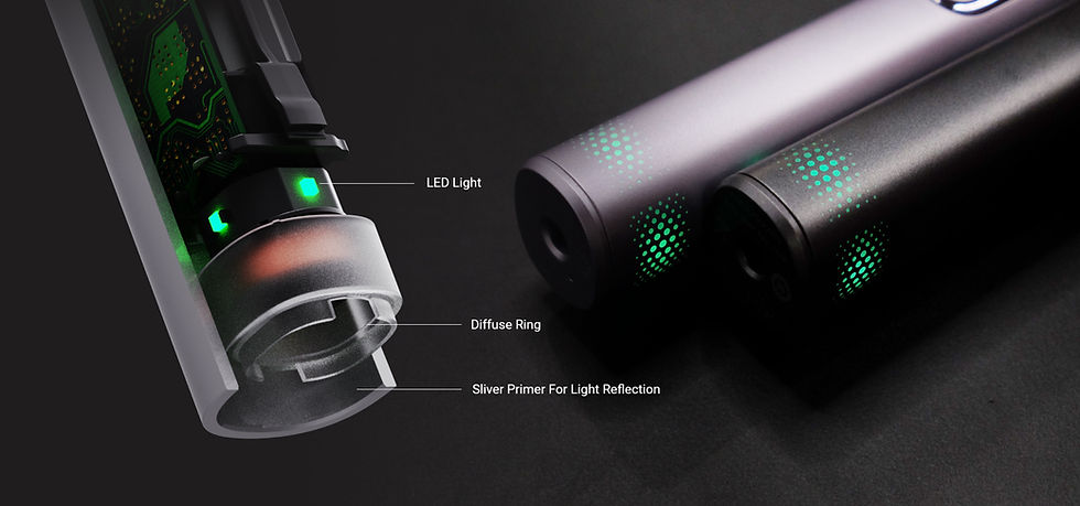
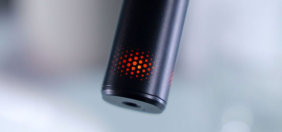
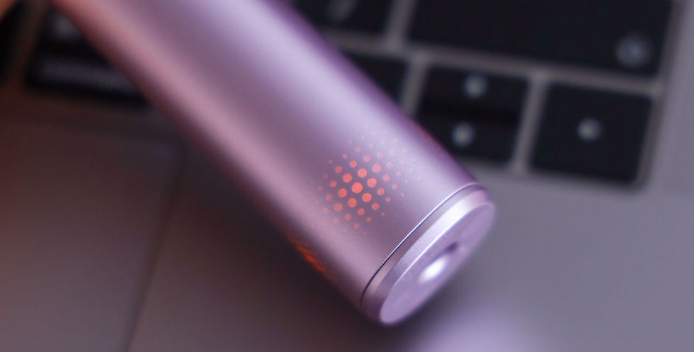
The second major challenge was developing the pressure reminder indicator light. Our concept was to use laser etching on the lacquered handle, selectively removing certain layers of lacquer to reveal a dotted lighting pattern when the reminder is activated.
Throughout the process, we also experimented with various lighting patterns, producing real prototypes to evaluate the actual illumination effects. We tested different dot arrangements, densities, and etching depths to achieve the optimal balance between visibility and elegance. By iterating on these samples, we refined the lighting diffusion and consistency, ensuring the pressure reminder blends seamlessly into the handle design while providing clear and intuitive feedback during use.
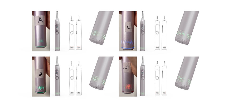
During the lighting development, aside from perfecting the pattern, the biggest challenge was achieving a uniform and bright light diffusion from a single LED. After extensive research and collaboration with R&D, we found the optimal solution:
-
Reflective Primer Base – Applying a high-reflectivity primer inside the handle to enhance light bouncing and maximize brightness.
-
Textured Diffuse Ring – Incorporating a rough-textured diffusion ring in the middle layer to scatter the light evenly across the surface.
-
LED Power Optimization – Carefully adjusting the LED output to strike the perfect balance between brightness and energy efficiency.
Through continuous prototyping and fine-tuning, we successfully created a seamless, well-distributed lighting effect that ensures the pressure reminder is both visually striking and elegantly integrated into the design.
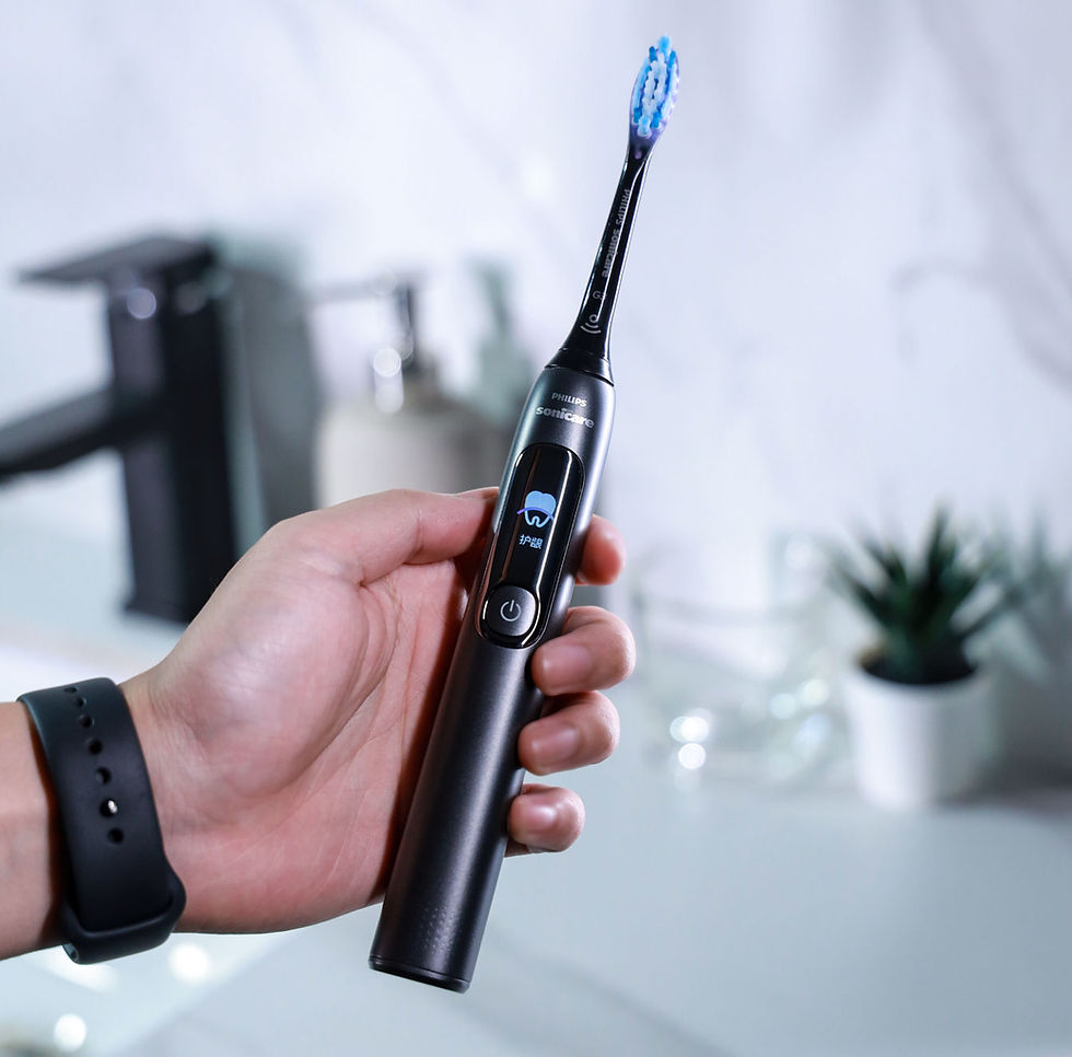
The most critical aspect—the User Interface (UI) design—went through multiple rounds of testing, refinement, and iteration with our UX designers, stakeholders, and usability experts. Through extensive usability testing, we fine-tuned the UX flow to ensure a smooth and intuitive user experience. A huge thanks to our dedicated UI designer, who crafted clear, intuitive, yet warm icons that effectively communicate feedback and guidance to users.
This collaborative effort resulted in a UI that is not only functional and user-friendly but also emotionally engaging, enhancing the overall user-product interaction.
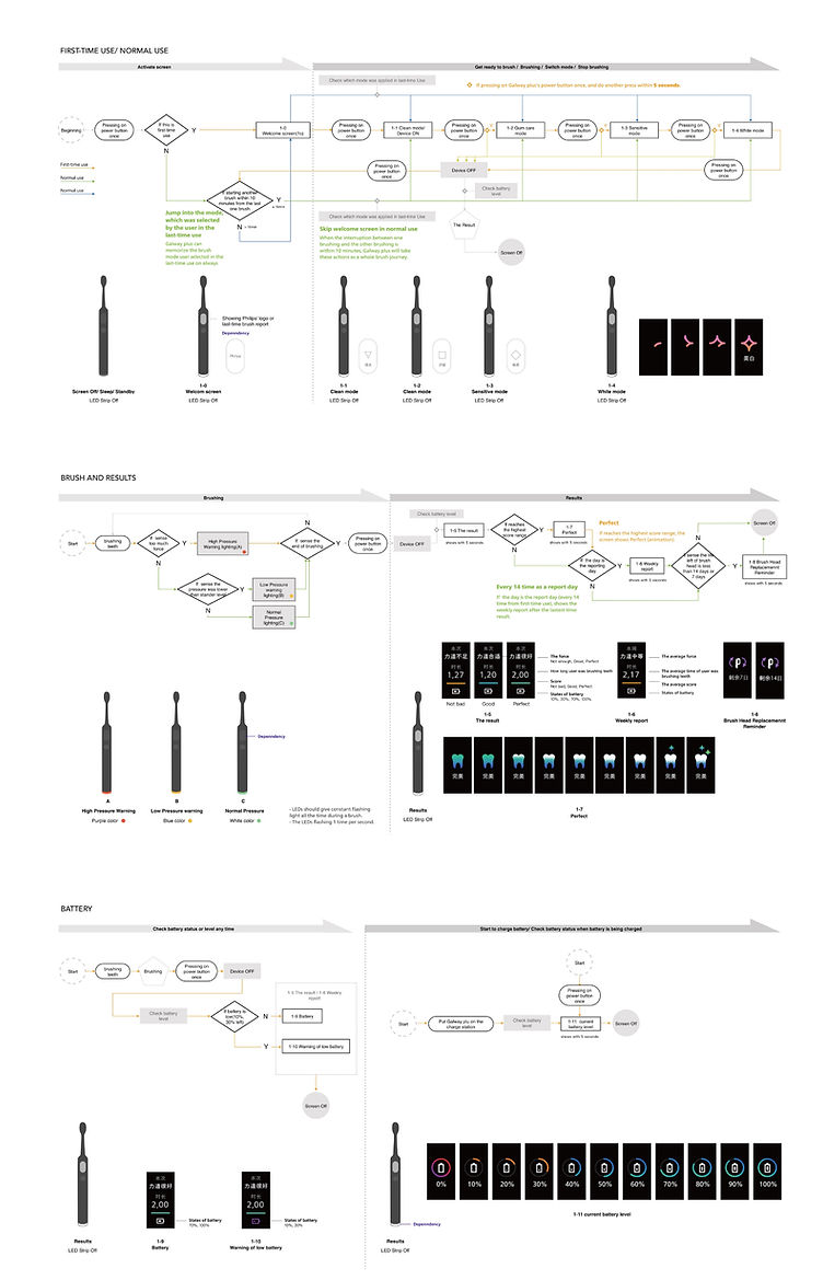
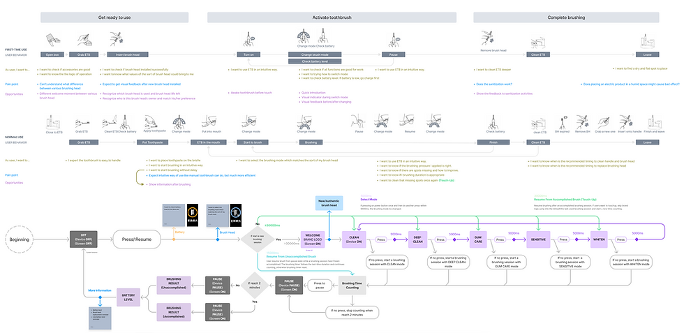
The biggest challenge in the UI design was achieving simplicity while keeping only one button for operation, despite having multiple pages to transition through.
To solve this, we carefully structured the UX flow, ensuring a logical and intuitive sequence of screens. The final design follows a step-by-step playback approach, displaying screens in the following order:
-
Power-on screen
-
Brush head replacement reminder
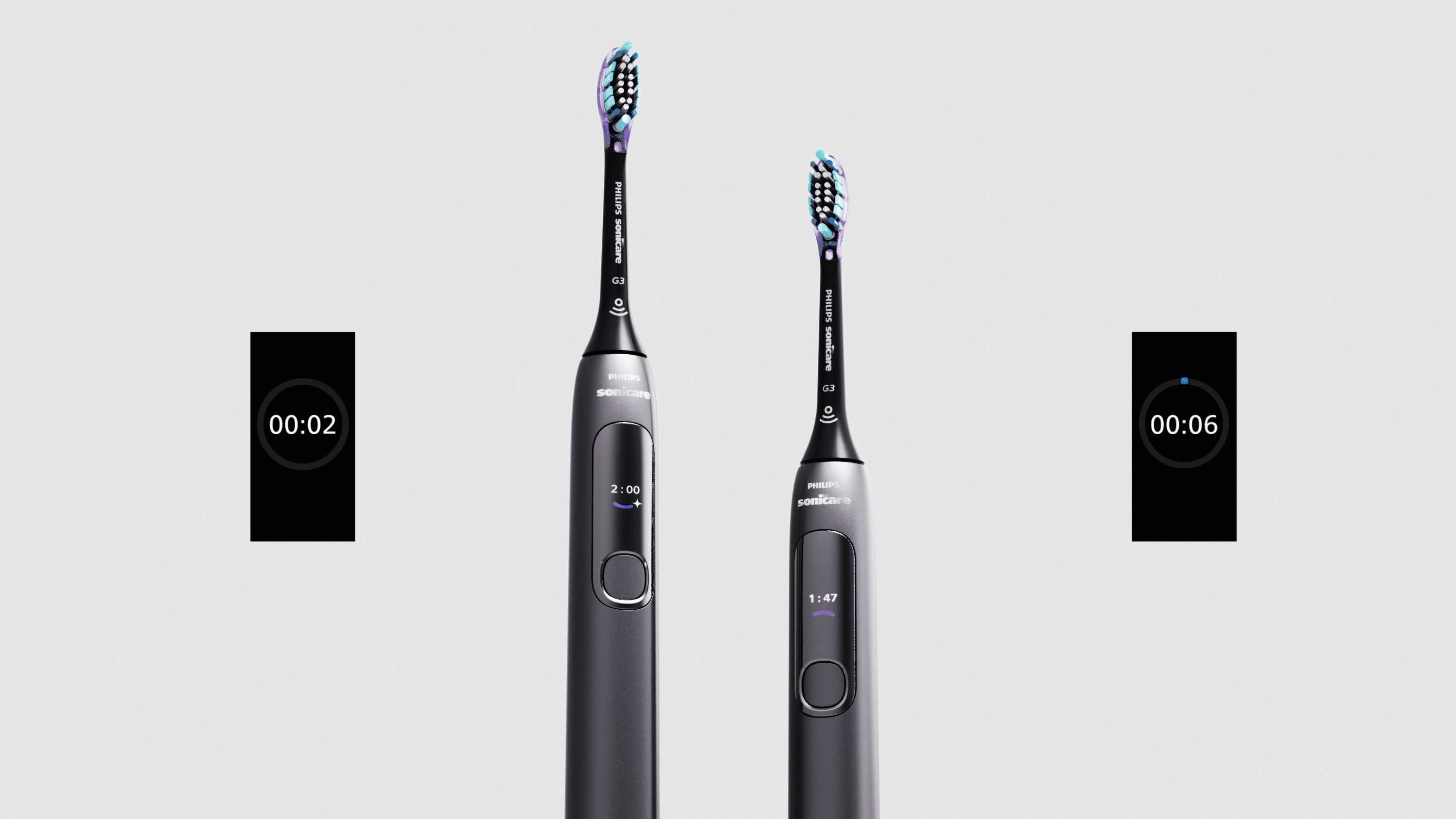
-
Mode selection
-
Brushing timer
-
Brushing performance feedback
-
Remaining battery display
This structured flow ensures that users receive the necessary information at the right time without overwhelming them, maximizing usability while maintaining a seamless interaction.
Another key feature is the post-brushing feedback, where the toothbrush provides a summary based on brushing duration. To enhance the emotional bonding with users, we designed a warm and charming emotional icon animation. This animation visually reacts to the user’s brushing performance, creating a delightful and engaging experience rather than just displaying dry data. The goal was to make the feedback feel encouraging, reinforcing positive brushing habits in a way that feels friendly and rewarding.
In addition, we paid close attention to avoiding unnecessary battery consumption. To achieve this, we integrated a pressure sensing feature that detects when the user is brushing. When brushing is detected, the screen automatically turns off to conserve power.
In the charging scenario, we also carefully considered how to use the screen and lighting to indicate the charging status. For example, when the toothbrush is placed on the charger, the screen can display a charging animation or percentage progress, giving users clear feedback about the current charge level.
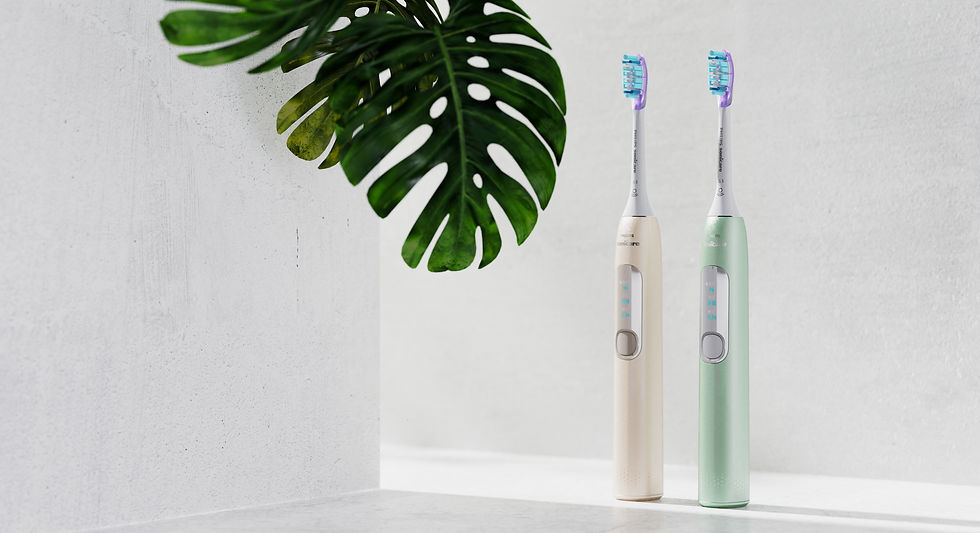
For CMF, we explored various possibilities to convey a premium and modern smart feel. After testing different combinations, we ultimately selected black and pink as the final color scheme. This choice was carefully made to meet the expectations of our target audience, striking a balance between elegance, sophistication, and the more playful, approachable elements. The black color represents professionalism, sleekness, and high-end luxury, while the pink adds a touch of warmth, modernity, and uniqueness. This combination resonates with the youthful, yet discerning demographic, providing both style and functionality.
The final product was launched in 2023, quickly gaining significant popularity among Chinese consumers and receiving strong recognition from the company’s business stakeholders.
Following its success in China, it was subsequently launched in Hong Kong, Taiwan, Europe, and the United States. The product’s innovative design and user experience led it to receive prestigious awards, including the 2024 Red Dot Design Award and the 2024 Design for Asia Award, marking a major milestone in its global success. This recognition not only validates the design's excellence but also highlights its impact on the market and the positive reception from international audiences.

Following my departure from Philips, the successor team introduced an upgraded version
— DiamondClean Essential Pro
— retaining the original product design and overall UI framework, with enhancements including a new brushing report interface and updated CMF execution.
The upgraded Pro version was recognized with the 2026 iF Design Award, reflecting the continued strength and relevance of the original design foundation.


