Beyond Aesthetics
/
Designing Value Before
Designing a Product
Project: Philips A9 Flagship Desk Lamp
Brand: Philips
Year: 2026
#ValueProposition #ArchitectureDesign #ProductDesignStrategy
In recent years, sales of Philips’ premium eye-care desk lamps declined, leading the business unit to initiate a new flagship desk lamp project. As the design lead, my involvement began before form or features—by questioning what value this new product should truly deliver.
The previous premium series was developed several years ago, and market tendencies had since evolved. Users were gravitating toward heavier-duty architectures with larger emission panels, while light sources were positioned increasingly higher and further away from the desktop.
These shifts raised a fundamental question: what problem were users actually trying to solve by moving light further away and making it larger?
Rather than simply following this trend, the project became an opportunity to understand the deeper reasons behind it—and to explore how new value could be created for users.
At Philips, product innovation follows a well-established idea-to-market development protocol, ensuring that each stage is clearly defined and validated.
In practice, however, much of the attention from product managers and designers tends to concentrate on the later stages of product development and execution.
From my perspective, the most critical—and often overlooked—phases lie much earlier in the process: value proposition creation, and architecture & platform creation.
These stages focus on deeply understanding user needs and translating them into a foundational product architecture that balances user value, technology, business constraints, and long-term scalability.

Through the lens of the Double Diamond design process, value proposition creation aligns closely with the Discover and Define phases, while architecture and platform creation corresponds to Develop. Product design Development, then, becomes the final Deliver—built upon decisions made much earlier.
In other words, when problem and offer are poorly defined, even a perfectly executed design will struggle to earn user empathy—or justify its existence in the market.

During my time at Signify, I participated in a Value Proposition Creation (VPC) workshop led by Mat Shore. His framework defines six elements in a clear sequence:
1. Target, 2. Insights, 3. Alternatives, 4. Benefit, 5. Reason to Believe, and 6. Superiority,
ensuring value is built step by step rather than assumed.
The most critical step is defining the target.
As Mat pointed out, value is subjective: a USD 30,000 Hermès bag may feel completely justified to his wife, yet meaningless to him. The product remains the same—only the target changes.
This is why VPC must start with a clear definition of who the product is for.

In Consumer BU, the primary target within the eye-care lighting category is the parent–child combination. In China, parents place strong attention on children’s academic performance, and children spend long hours at the desk for study and related activities. This makes eye-care lighting a category with significant potential for this target group.
For this audience, we define the target with clarity—covering demographics, user scenarios, and usage contexts. In addition, in-depth user research is conducted every few years to continuously understand evolving behaviors and expectations around eye-care lighting.


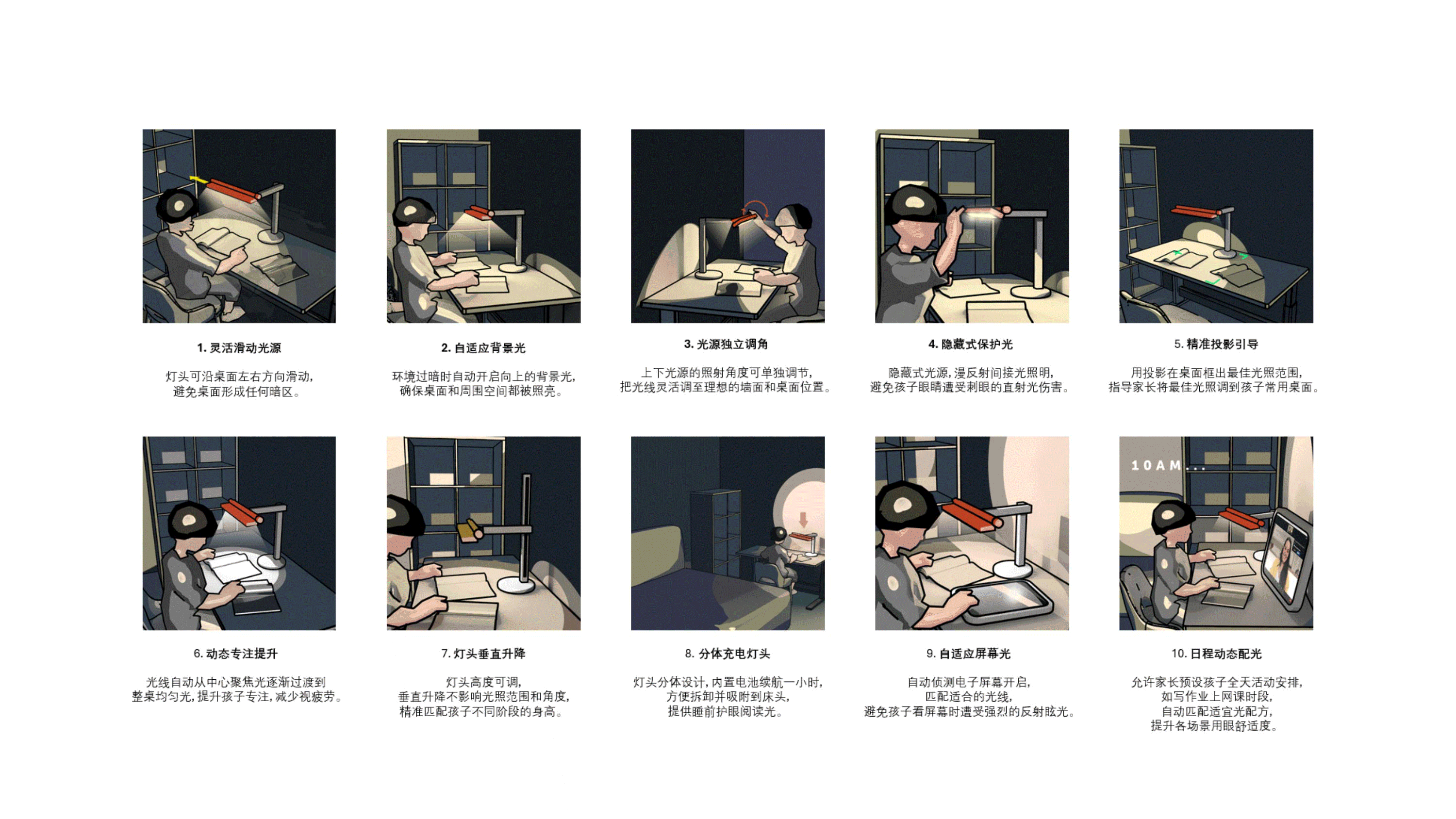
The next step was to uncover user insights. Building on research conducted by the product manager with over 50 parents, we examined how parents and children use lighting in their daily routines—focusing on behaviors, needs, and unmet expectations.
These findings were synthesized into a journey map that followed a child’s day from 6 a.m. to 10 p.m., capturing use cases, pain points, and opportunity areas for new product development.
To make the journey more vivid and tangible, I used Midjourney-generated illustrations to visualize key moments across the day. This helped participants immerse themselves in the co-creation workshop more easily and engage with the discussion at an emotional level.


To deepen these insights, we invited product managers, engineers, and two mothers who closely matched our target profile to participate in a journey mapping workshop. Together, we walked through an entire day, using the journey map as a shared foundation to spark discussion and ideation.
The co-creation workshop focused on identifying moments that resonated most with parents, clarifying pain points, and translating them into opportunity areas and user benefits.
We concluded by voting on the use cases the team believed were most critical to address, helping align cross-functional priorities early in the process.


Based on the inspiration and outcomes of the co-creation workshop, we selected ten most impactful use cases for users. We then conducted in-depth ideation to develop feasible solution ideas that effectively address these pain points.


User validation is a crucial step in the VPC process, helping us see which early ideas truly resonate with users and refine them accordingly. At this stage, we conducted qualitative research at the Tmall Innovation Center platform.
We used concise stimuli to make concepts easy to grasp —Blender 3D-to-2D animated GIFs helped users understand use cases quickly. Questionnaires were short and focused to respect users’ time.
This phase turns subjective assumptions into objective user needs.
The insights from user validation guided us in prioritizing which pain points to address for maximum impact. They also challenged some of our initial assumptions, highlighting gaps between perceived and real user needs.

At the same time, we conducted market benchmarking research to understand how our new offer compares to competitors and identify its points of superiority.


Beyond analyzing competitors to identify our offer’s superiority, we also reviewed the internal product portfolio strategy. At a high level, this ensured that the A9 clearly differentiates from mainstream products below it, while leaving room for potential higher-end offerings above.
We also considered how A-series' value proposition differentiates it from the F-series architecture solution, and whether its offer consistently reinforces the overarching story of the A-series.

Once we have identified potential solutions, it is beneficial to involve suppliers or in-house R&D teams early in the process. This allows for a preliminary feasibility assessment of the ideas, ensuring that they are not only innovative but also technically and economically viable.
For example, in the F9-Versa project, where we aimed to develop a movable floor lamp, we collaborated with suppliers early on to evaluate feasible concepts. We conducted prototype testing to verify the practicality of the design and gathered cost estimates to ensure it aligned with our target price range. These tests provided concrete evidence to stakeholders, demonstrating that the proposed direction was not only innovative but also cost-effective and manufacturable within our business constraints.

We worked with product manager and marketing to analyze the range build-up across the A-series, examining how features, articulation, and user interface differ between entry and premium models.
This helped us ensure each product tier delivers distinct value while maintaining a coherent identity.


From VPC To A&PC
The final step in VPC is the Reason to Believe
—substantiation that our offer and market claims are credible and achievable.
From here, we collaborate with R&D (mechanical, electronic, optical engineers) and suppliers to explore the technology, specifications, and product architecture needed to deliver the intended user benefits.
As designers, we start with idealized visuals to articulate our vision, then translate these blue-sky concepts step by step into practical, feasible solutions.
For A9, the core visions was exploring how to increase desktop illumination coverage.
To realize this core vision, we explored multiple approaches to increase desktop illumination coverage.
One approach focused on optical solution: optical engineers created prototypes and conducted lab measurements, which we reviewed together to assess the real-world visual effect.

Another approach explored mechanical mix electrical solutions, using sensors to trigger robotic arms and hinges that adjust the light position across the desk, expanding coverage dynamically.

In most cases, evaluating a technical solution is inseparable from evaluating the overall product architecture. A strong solution is never about applying a single technology to solve an isolated problem.
Architecture creation is fundamentally about balance.
For example, one approach we explored was introducing new mechanical articulation concepts
—such as sliding rails or a horizontal sweeping pivot—to allow users to manually adjust light position and extend left–right desktop coverage.
A&PC process relied heavily on iterative prototyping to simulate real scenarios and validate feasibility.
Each concept had to be critically assessed from multiple angles:
mechanical reliability, assembly sequence and risk, usability, visual impact, user experience, adaptability across different scenarios, packaging efficiency, and overall cost feasibility.
While each factor carries different weight, all must be considered together to achieve a balanced experience.
The new articulation approach seems to be capable of delivering our design vision.
However, it also introduced significant technical and usability challenges.
A dense and complex mechanical structure made the lamp head bulky, raising concerns around
1. Complexity of the assembling layout
2. Reliability, excess weight and sagging
3. Visual impact and user experience
4. Adaptability of other positioning requirement
While the combined optical and mechanical solutions proved over-specified for the actual user need
(target is 1.7m coverage).
Through iterative prototype studies—including 3D-printing volume reviews and functional mock-ups—
we worked closely with the product manager and key stakeholders to evaluate trade-offs and refine the feature list, ultimately evolving the concept into a more balanced and feasible architecture.
_jfif.jpg)


Throughout the entire A&PC process, the architecture was evaluated and iterated through nearly thirty versions, ranging from major structural changes to fine refinements.
Each iteration carefully balanced user experience, visual impact, and internal architectural complexity—including sensors and PCBA placement, assembling layout, and reliabiliy.
For each iteration, we evaluated beam movement and illumination coverage against the target scenarios defined at the VPC stage, ensuring the solution was effective without being over-specified.
We assessed potential glare at the user’s eye level, while validating whether the articulation design could adequately support light positioning across different user scenarios.

Compared to the original architecture, we deliberately reduced the feature set and refocused the product on the most impactful attributes. This allowed us to achieve a well-balanced solution that combines high-performing optics, a slim and lightweight lamp body, intuitive user experience, and a robust, reliable structure.

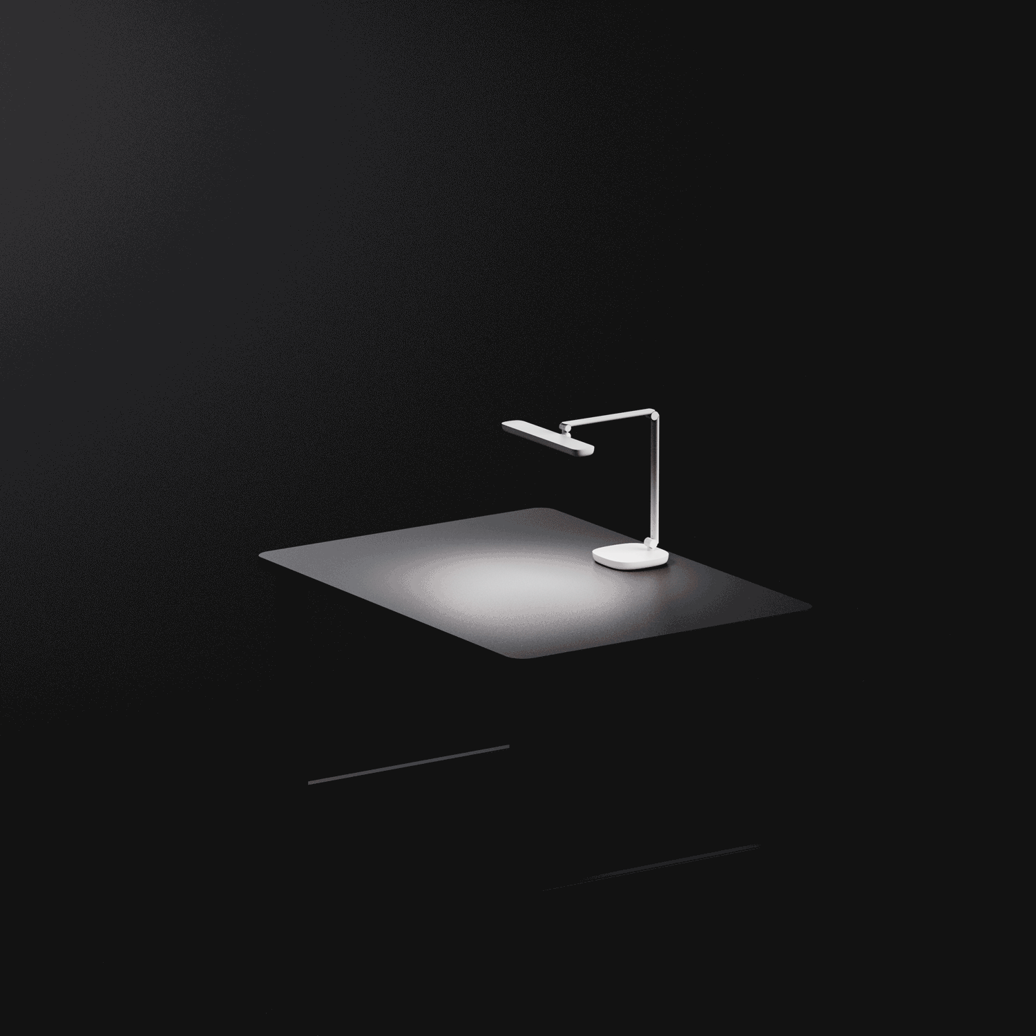
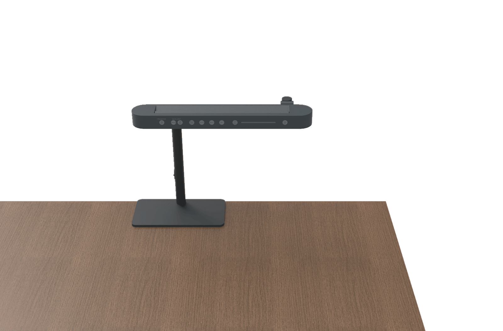
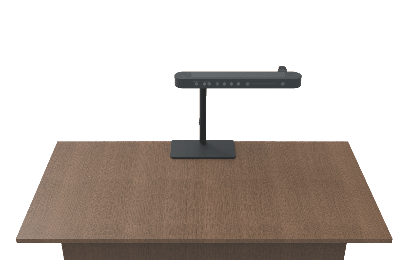
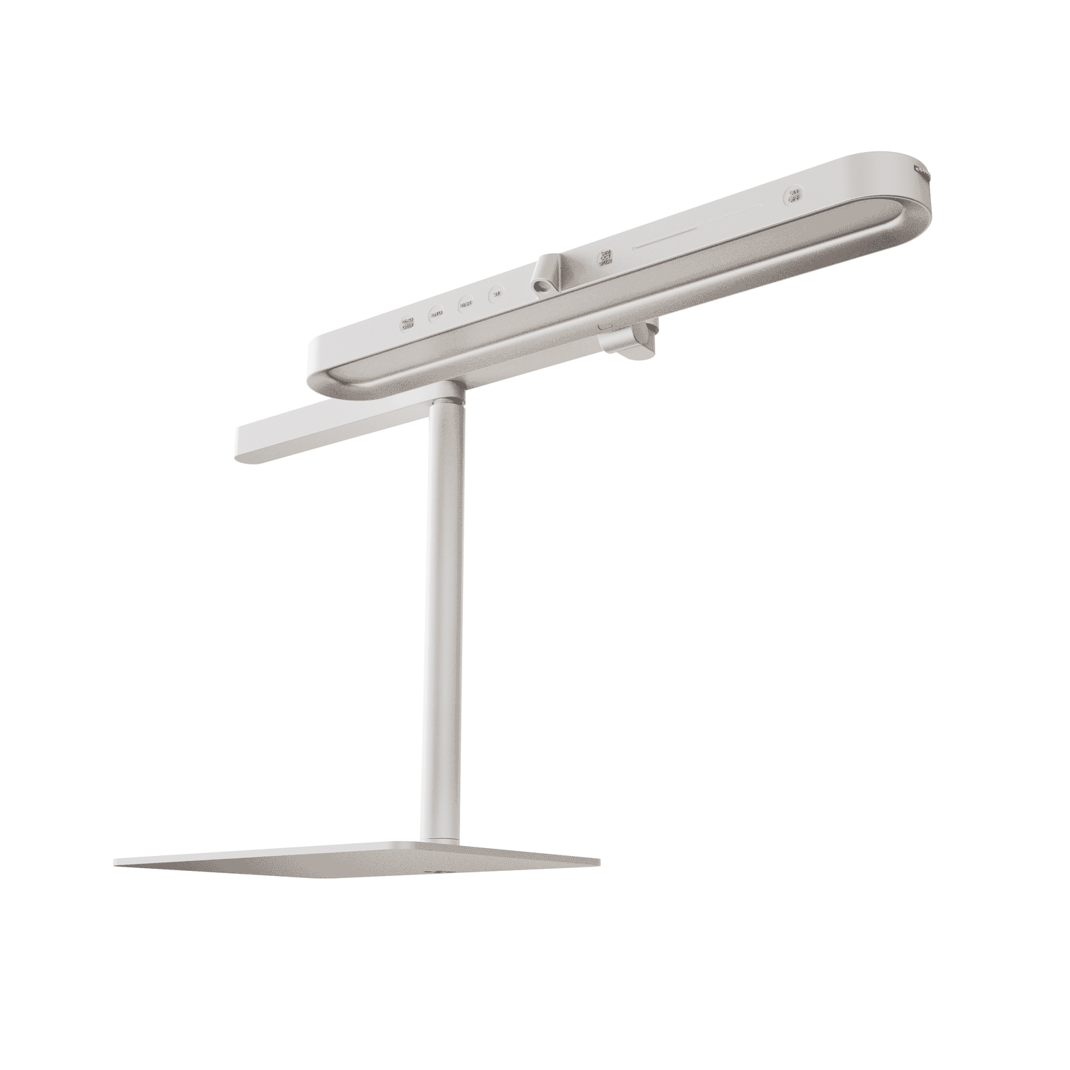
The most outstanding feature is the vision of three-dimensional illumination. A9 integrates the latest wall-washer technology to illuminate not only the desk, but also the surrounding space and the wall behind it
—reducing eye fatigue caused by high contrast between the work surface and its environment.
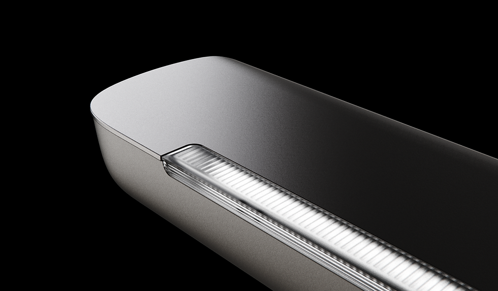
For the downward task light, A9 features a newly developed dual-layer optical design.
On top of the existing front polarizing lens, a secondary curved left–right lens combined with two additional light sources refracts light toward the sides of the desk, significantly expanding coverage to 1.8 m in width and 0.7 m in depth.
Through the intuitive UI, users can adjust the output ratio and light distribution between the two sources, enabling seamless transitions between high-focus study and softer multi-tasking use cases.

In styling, we follow the Design Language System, with a focus on dynamic lines language.
Flowing, clean, and expressive curves are used to soften the originally heavy, equipment-like architecture.
Through restrained material combinations and subtle visual contrast, the design enhances a sense of home, transforming a technical structure into a light, agile, and elegant luminaire that naturally blends into living spaces.


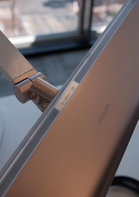
The wall-washer lens is refined with subtle curvature and linear textures, intentionally softening the transition between upper and lower light to create a calm and seamless lighting experience.
Beneath the lens, a centered plateau features the Ocumax 3D emblem, subtly expressing the pioneering eyecare proposition and reinforcing the product’s three-dimensional lighting vision.


In the user experience design, interaction is structured around two primary touchpoints.
The first is a precision control interface on the front of the lamp head.
The panel is divided into two zones: the left side activates functions such as sensing features and preset modes, while the right side allows users to select brightness, color temperature, and light distribution, then fine-tune them seamlessly via a touch slider.


Once preferred settings are established, users can rely on the second touchpoint—gesture sensing.
A simple hand swipe beneath the sensor on the lower right of the lamp enables quick on/off access, reducing friction in everyday use.


Beyond optical performance, articulation is the second key offer of A9.
Thoughtful articulation allows light to be positioned precisely where users need it
.
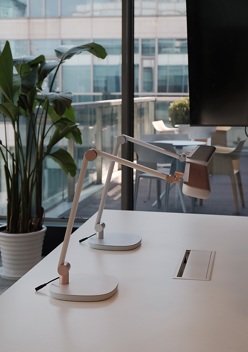
A9 features a 6-axis, dual-arm articulation system, including two horizontal pivot points that enable lateral sweeping of the lamp head to extend illumination across the desk.This articulation also adapts to different desk layouts, ensuring optimal, eye-care lighting in a wide range of use scenarios.


Arm is sculpted with soft, continuous curves and a refined pearlescent finish, conveying a sense of warmth and approachability. In contrast, the hinges are defined by precise cylindrical geometries and metallic detailing, articulating a deliberate balance between domestic elegance and engineering precision.


The base incorporates an iconic squircle form that echoes the lamp’s overall geometry for a cohesive language. Designed to be detachable, it can be replaced with a clamp base, extending the product’s adaptability across different desk setups and user scenarios.


Guided by the PDLS color strategy, we proposed two CMF directions: a neutral pearlescent grey-white paired with metallic silver, and a warm creamy pearlescent ivory paired with rose gold. Both lacquer finishes were refined through multiple physical prototypes to achieve the intended visual depth and premium quality.