Beyond the Brief
/
Defining the Strategy
Before Shaping the Product
Project: Philips A9 Desk Lamp
Brand: Philips
Year: 2026
#ValueProposition #ArchitectureCreation #DesignStrategy
Project Context /
Previous Flagship A7 was losing its competitive edge.
China's children eyecare luminaires market was becoming increasingly competitive, with competitors iterating rapidly in technology. In H2 2024, Business started looking into a new generation of flagship products.
Development Culture /
The business was heavily ODM-driven.
For flagship products like A7, development was largely outsourced to external partners. Internally, the team was used to reviewing supplier concepts, selecting interesting ones, and then styling around the supplier's solution. There was no established process or culture for developing products from user needs.

Inside-out Mindset /
A9 started the same way.
A new supplier came in with a fancy mechanical concept — sliding rails and a folding articulated arm.
The expectation was simple: design would make the solution look better.
Question Before Designing /
Our first reaction wasn't to judge whether the supplier solution was good or bad
— or immediately start styling it.
Instead, we started asking questions.
-
Who are we designing for?
-
What user problem are we solving?
-
What do we actually know vs. assume?
-
Is the supplier concept technically proven?
-
Do we have enough time to validate what we don't know?
Fortunately, the product was planned for a Q3 2025 launch, giving us enough time to step back and change the process.
Together with the project team, we restructured the development plan to create space for:
-
Understanding the user and their needs
-
Redefine the product offers and claims
-
Build the architectural solution
-
Turning unknowns into evidence
Instead of designing around ambiguities, we created time to validate them first.

Value Proposition Creation : Defining the User /
We started by redefining who A9 was really for.
I initiated a series of weekly workshops with the Product Manager to explore:
-
Who is our target user?
-
What are their lifestyles and needs?
-
Where and how would they use A9?
Through these discussions, we gradually built a shared understanding of the target user and context of use.



User Journey Mapping /
Business had previously conducted quantitative research with 30 parent-child households, capturing their daily routines and pain points with lighting, but the information was fragmented.
I brought it together into a 6AM to 10PM journey, so we could look at the user's entire day and use it as a starting point for our workshop.”

Bridging Cognition via GenAI Stimuli /
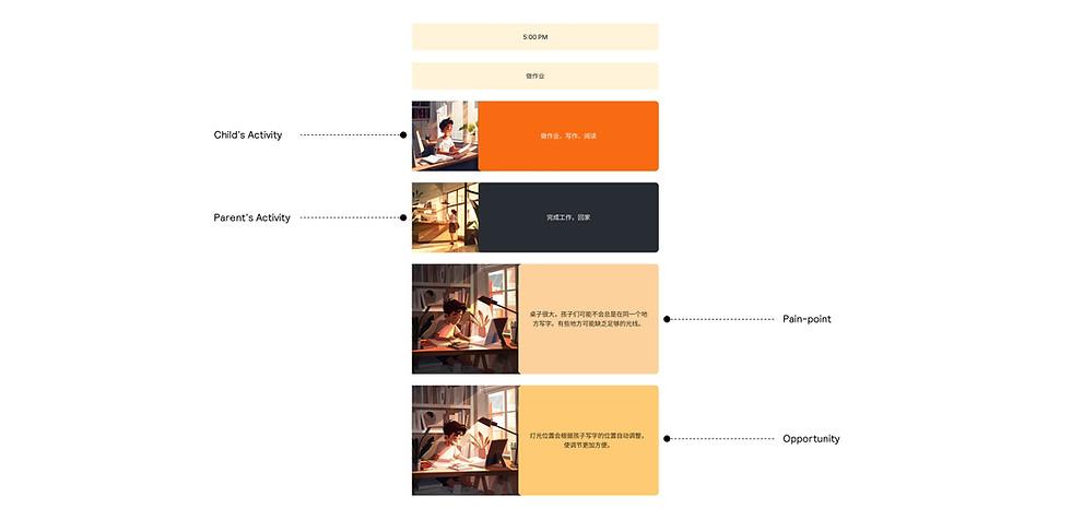
To help the workshop participants quickly visualise the user's context and empathise with their experience,
I used Midjourney AI to turn key activities, assumed pain points and opportunities into visual illustrations.
This made the user journey more tangible and easier for the team to discuss.
The Co-Creation Workshop : Challenging Our Assumptions /
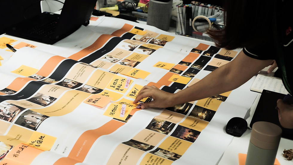
I organised a user journey mapping workshop with the Product Manager, two colleagues who matched our target user profile, and an optical engineer. Together, we walked through a day in the life of a mother and child, from morning to night.
And I made it clear that the journey map was an assumption, not an answer
— Everyone was encouraged to challenge it, share their own experiences,
and point out anything that didn't feel realistic.

From Insight to Opportunity /
One insight from the workshop really stood out.
One mother shared that she had bought her child a 1.7m-wide desk to support their increasingly diverse learning activities. But the existing A7 could not cover the entire desk.
“It would be great if the light could be as wide as the desk.”
The problem wasn't brightness — the light was already bright enough. The real opportunity was coverage.
So one of our key design challenges became:
How might we extend comfortable, eye-friendly light across a wider workspace?
Strategic Voting : Narrowing the Focus/
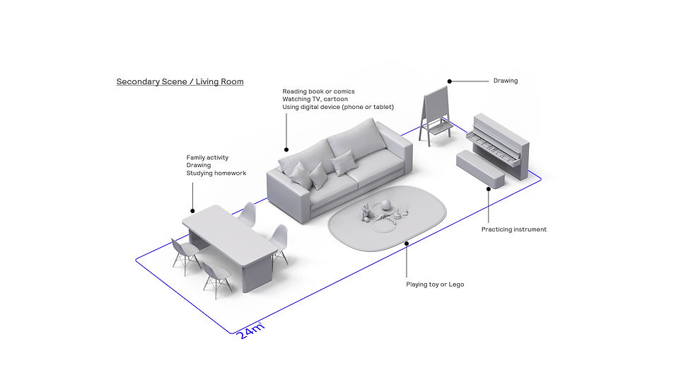
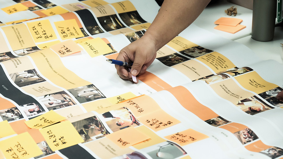
The full journey revealed 30+ potential use cases. To avoid trying to solve everything, I added a voting session where participants identified the three most impactful use cases.
We then narrowed the opportunity space down to 10 use cases to focus on.

From Hypotheses to Evidence /
The workshop gave us qualitative hypotheses.
But we wanted to know: is this a real user need, or just a few people's opinions?
So we partnered with the Market Insights team to quantitatively validate the 10 key use cases.
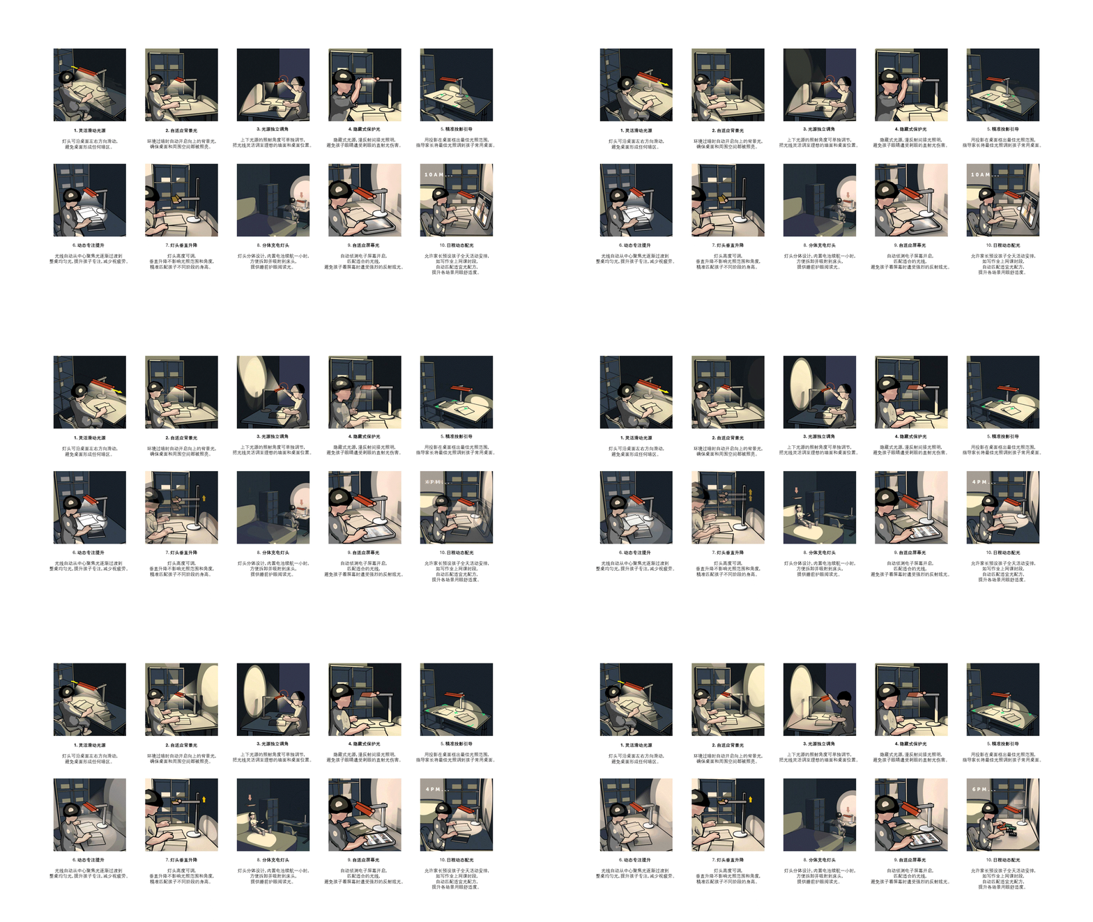
We redesigned both the survey questions and wording, and used Blender 3D-to-2D tools to quickly turn the use cases into short 2D GIFs. This made the scenarios easier to understand on mobile and helped reduce survey fatigue and random responses.
Defining What Matters /
The survey helped us identify which use cases resonated most strongly with users and were worth solving.
This allowed us to separate the opportunities into:
Must Have — high-impact user needs
Nice to Have — lower-priority opportunities

Defining A9's Role in the portfolio /
Since 2024, I had been overseeing the design direction across the desk and floor luminaires portfolio.
I initiated a workshop to define our entry-to-premium portfolio strategy
— what should differentiate each tier,
and how optical, electrical and mechanical solutions could create increasing value.
This became an ongoing discussion throughout each project:
Where should this product sit within the portfolio, and what should it uniquely offer? A9 was no exception.


Architecture & Platform Creation : Building the Balanced Architecture /
Once we defined the product offering, we started exploring architecture solutions to deliver it.
Initially, Product Manager wanted to add as many features as possible. On paper, the specs looked highly competitive. But we realised that specs were only one part of the equation.
We also needed to consider: User experience · Product volume · Reliability · Cost
These dimensions required more time to evaluate and validate.
Ignoring them could easily lead to an unbalanced product offering.
So together with the project team, we created a multi-dimensional evaluation matrix to assess each architecture solution from different perspectives.

A Concrete Example: The Coverage Dilemma /
A great example of this challenge happened right after our VPC phase:
Our consumer test showed a strong demand for wider light coverage.
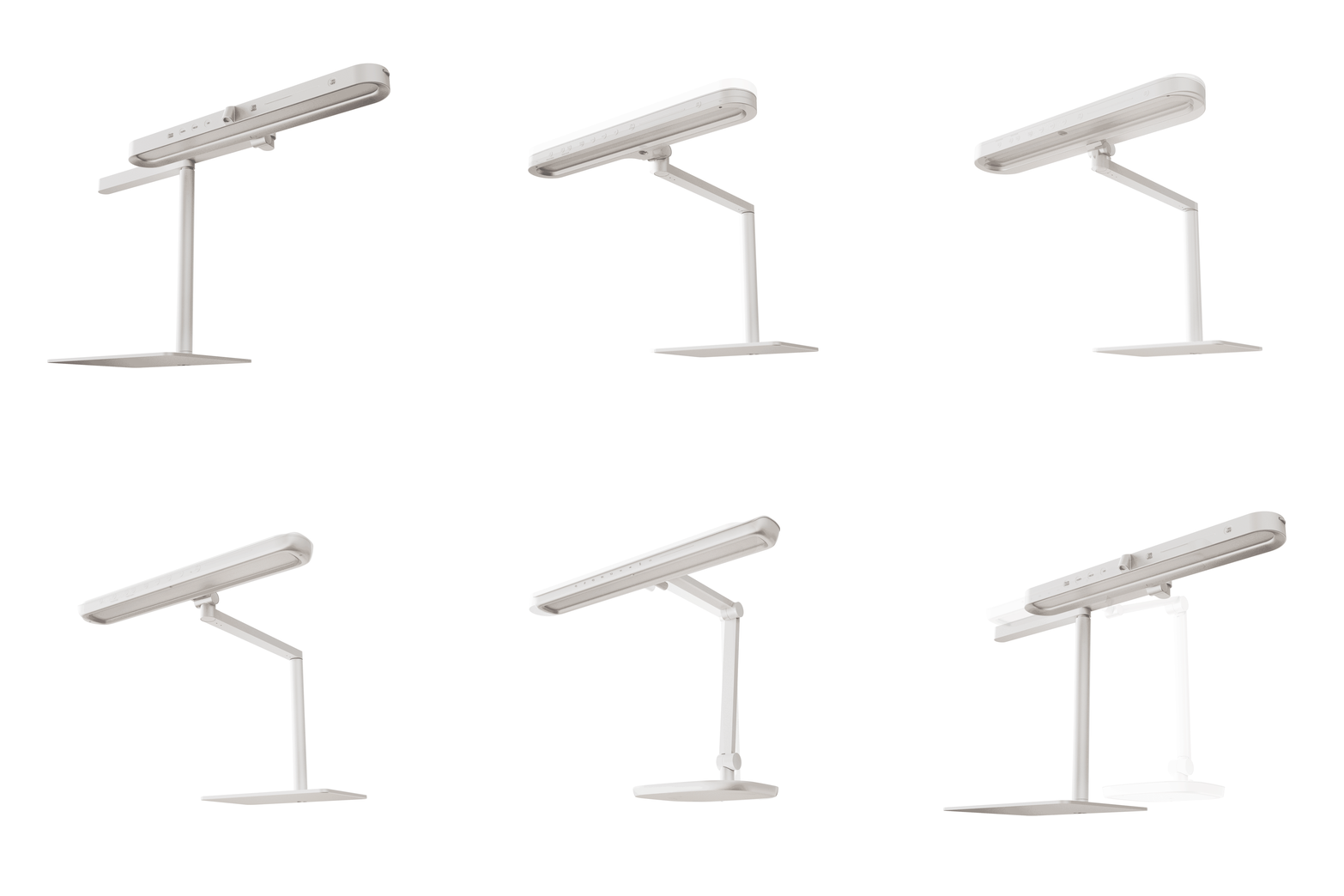
R&D proposed three solutions: a slider, a horizontal pivot, and a new optical lens.
On paper, combining all three looked incredibly powerful.”

The Reality Check: But was it the right product? /
Individually, each solution seemed feasible.
But when we combined them into one architecture, the trade-offs started to surface.
1. Assembly The mechanism became too complex, increasing the risk of assembly errors.
2. Weight The heavy lamp head caused the arm to sag when moved to the side.
3. UX The weight also made the slider stiff and difficult to use.
4. Visual The accumulated components made the lamp head too large and visually heavy.
5. Value Most importantly, the combined solution exceeded our 1.7m coverage target
— adding performance that users didn't actually need.
Our matrix made the problem clear: the architecture was over-engineered and unbalanced.
_jfif.jpg)


Another Reality Check : The "Robotic Arm" Idea /
In 2025, leadership proposed taking the articulation further with sensors and robotic automation.
The specs sounded great and innovative.
But when we built a prototype, we discovered questions that specs couldn't answer:
Is it safe? Could the moving arm hit the child or furniture?
Is it distracting? Could the movement interrupt the child's focus?
Is it actually better? Is motorised adjustment really more efficient than doing it by hand?
Answering these questions would require more validation than our launch window allowed.
So we put the idea on hold.
15+ Iterations for Perfect Balance /
We explored 15+ architecture solutions,
mainly simplifying the original over-spec concepts into more balanced solutions.
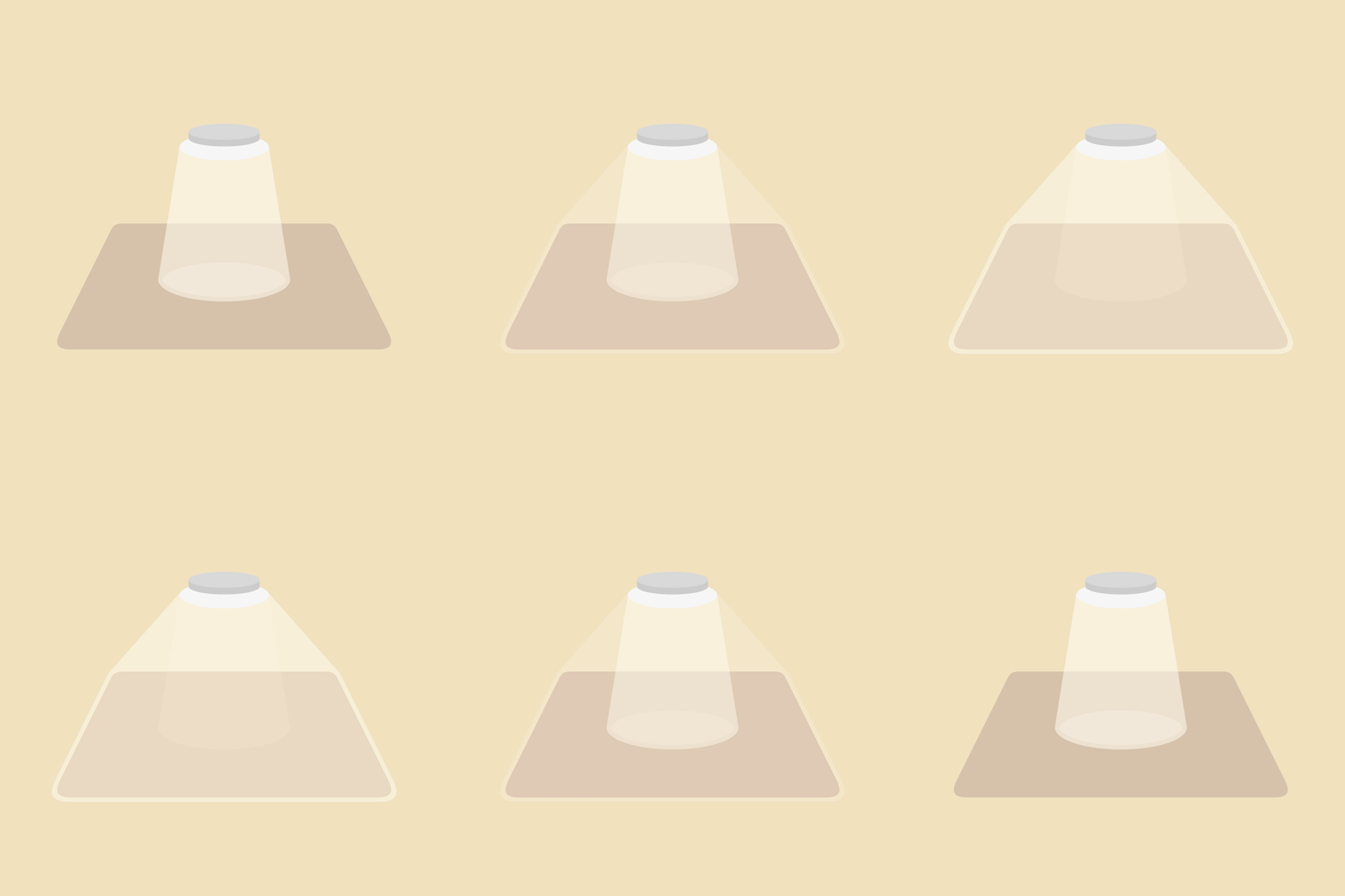
Along the way, we developed a simple way to evaluate each iteration: Visualise the actual light coverage.
This made it immediately clear whether a solution was: Not enough → Just right → Over-delivering
Once we could meet the target coverage,
we stopped adding more features and protected the other dimensions of the product
— UX, size, reliability and cost.
The goal wasn't to maximise performance. It was to meet the need without compromising the product.


The Hero Feature: Bringing Professional Wall-Washing Home /
The most compelling and striking feature
—and the one that connected most deeply with users in our consumer tests—
was the addition of the auxiliary wall-washer light.
Instead of just lighting up the desk, we projected light onto the wall behind it.
To do this, we brought Philips’ professional facade lighting technology directly into the home environment.
By lighting up the large wall surface evenly, we drastically reduced the harsh visual contrast between the bright desk and the dark background. This eliminated the major cause of eye strain and discomfort for children during long hours of studying.
Optimizing Downward Optics for Expanding Light Coverage /
We also looked at how to extend the main light horizontally.
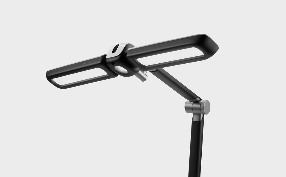
By adding side-wing lenses and secondary LEDs to the existing optical system, we were able to push the light further sideways and create a wider, more uniform coverage.

From Specs to a Story : OcuMax 3D /
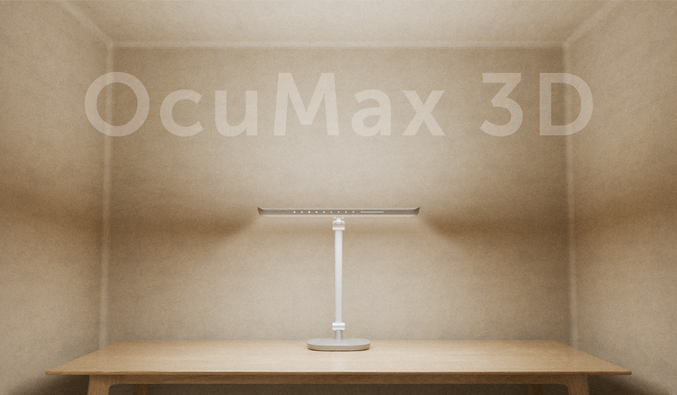
By combining the main desk light with the wall-washer, we created a new flagship proposition: OcuMax 3D.
Instead of presenting it as a collection of upgraded specs,
we turned the technology into a simple user-facing story:
X + Y — the desk is illuminated across the workspace
Z — the wall behind the user is also illuminated Together,
they create a 3D lighting environment around the user. We didn't just make A9 more powerful.
We made its value easier to understand.
Translating the Design Language /
Once the architecture was defined, we moved into design styling.
We applied the design language we had previously defined for the desk and floor portfolio.


Form & CMF Execution: Visual Lightness Through Design /
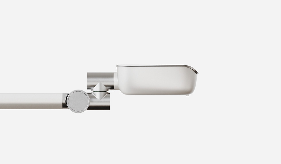
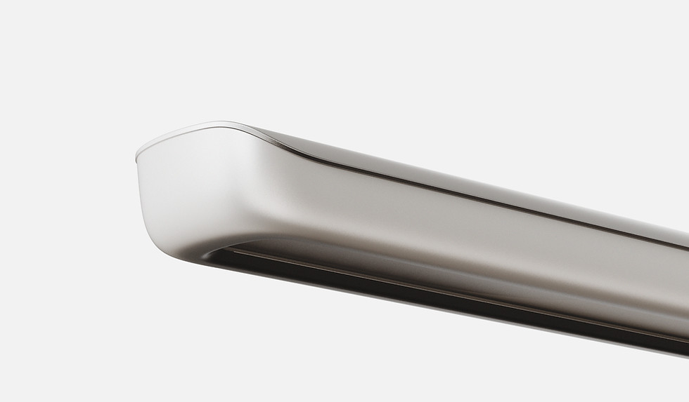
The core expression was “Homey”
— transforming complex, technical engineering into a product that could feel more like a piece of furniture, while maintaining Philips' high-tech credibility.
We had previously explored this language on our flagship floor luminaires, using organic, streamlined geometry to visually soften the engineering inside.
For A9, we applied the same principle: Soft and warm in expression, precise and technical in execution.

Prototyping & Form Refinement /
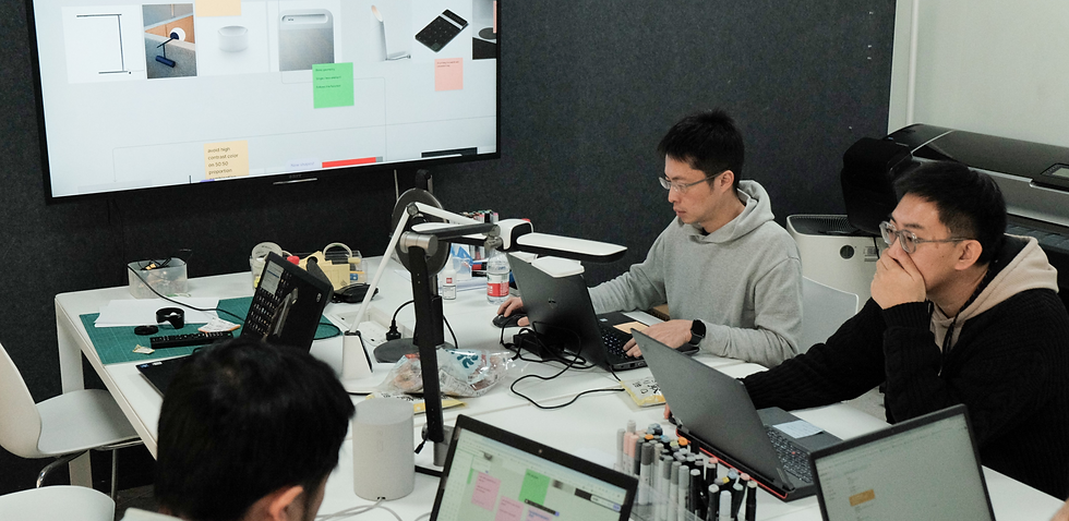
We built multiple physical prototypes to refine the form and validate the details.
We iterated on the surface curvature, material split and silhouette continuity, using physical models to evaluate the product from every angle.
This hands-on process helped us achieve a form that felt balanced, premium and refined.

Refining the Wall-Washer /
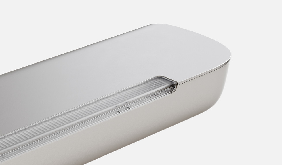
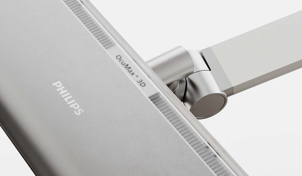
We worked closely with our optics engineers to refine the wall-washer lens.
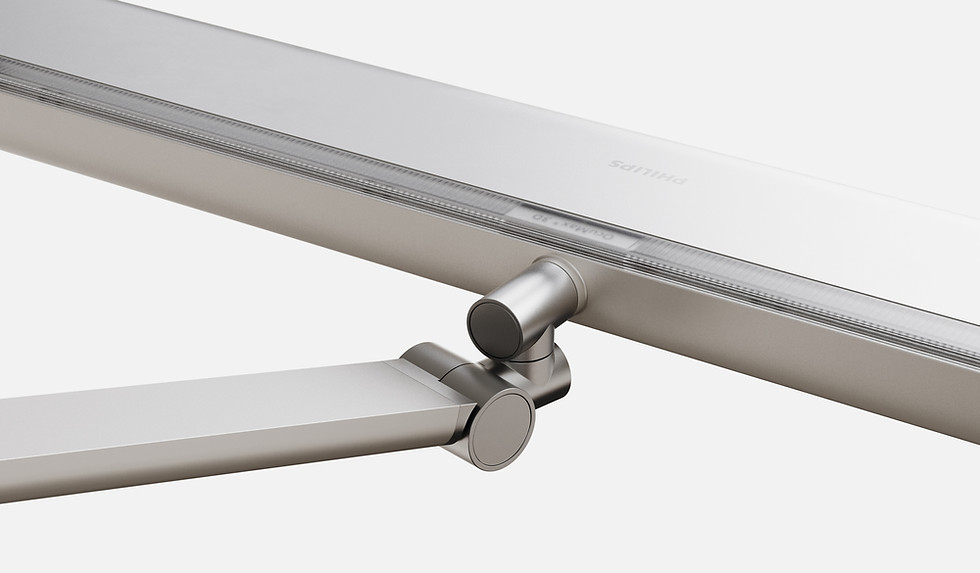
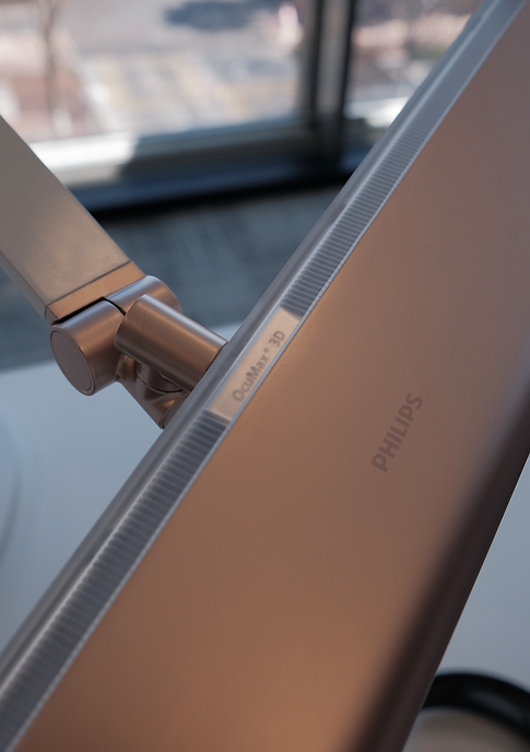
A micro-striped texture was added to the lens to create more even light distribution and soften the transition between the upper and lower light sources.
We also integrated the OcuMax 3D emblem directly into the lens,
turning a technical component into a subtle brand touchpoint.

UX Strategy : From Learning to Daily Use /
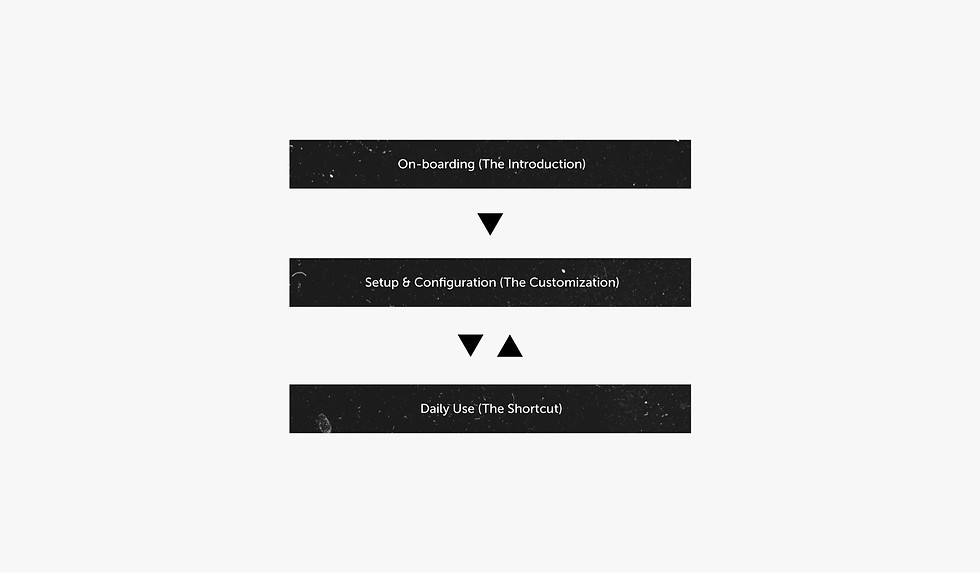
We structured the UX around three stages of the user's journey:
1. Onboarding — Learn Help new users understand the controls.
2. Setup — Personalise Let users configure brightness, colour temperature and smart features to their needs. 3. Daily Use — Simplify Once configured, most users rarely change the settings.
They simply want to turn the lamp on and off quickly.
This led us to design the UX around a simple principle:
Teach first. Personalise once. Simplify every day.
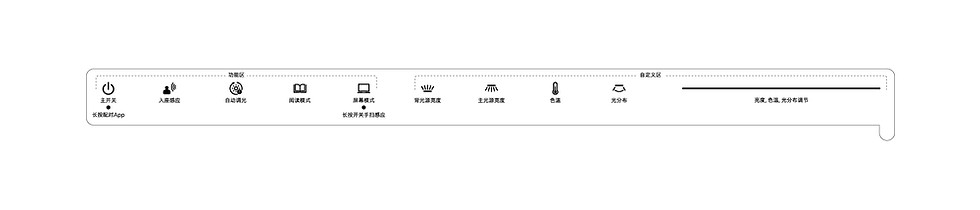
Stage 1 : Removable On-boarding Guide /
Stage 1 — Learn For onboarding,
we added a removable transparent guide directly onto the lamp's interface. It explains the controls and hidden secondary functions, helping users understand the interface straight out of the box.
Once they become familiar with it, they simply peel it off to reveal a clean, premium interface.
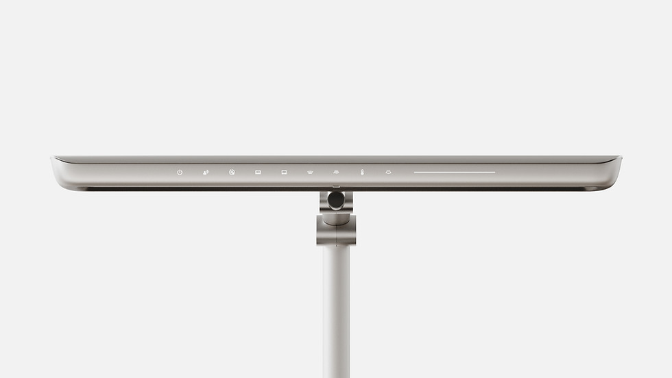
Stage 2 : Personalise /
For setup, we divided the interface into two simple zones:
Left/ One click activate For on/off and smart functions.
Low-frequency functions are hidden behind a long press to keep the interface clean.
Right/ Tune Users first select what they want to adjust (such as brightness dimming or colour temperature)
Then use the touch bar for smooth, precise control.

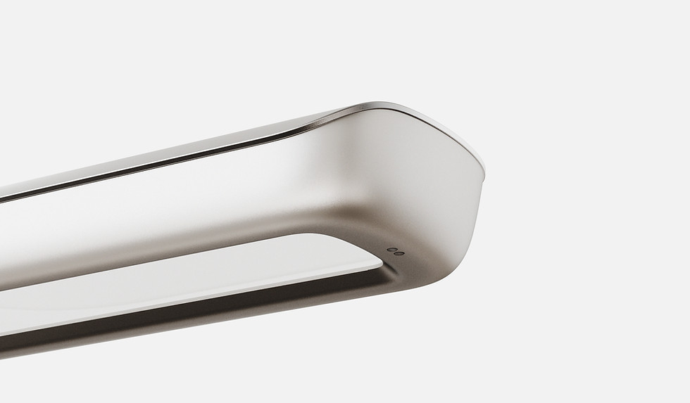
Stage 3 : The Shortcut Control /
For daily use, we wanted a quick, effortless shortcut,
so we introduced a gesture sensor for touchless on/off control.
Our first concept placed the sensor in the centre.
But prototyping revealed two problems: it had to protrude from the housing, creating glare,
and its position increased the risk of accidental activation.
Since eye comfort was our top priority, we dropped the concept. We moved the sensor to the far right side, allowing users to simply wave their hand underneath to turn the lamp on or off
— while keeping the sensor away from the light source.

Articulation System : Designed for Precision /
The horizontal swivel became a key part of the experience.
Users can smoothly move the lamp head from left to right, allowing light to follow across a larger workspace.
Combined with the 6-axis, dual-arm system, users can position the light exactly where they need it.
We then translated this sense of precision and care into the physical details.
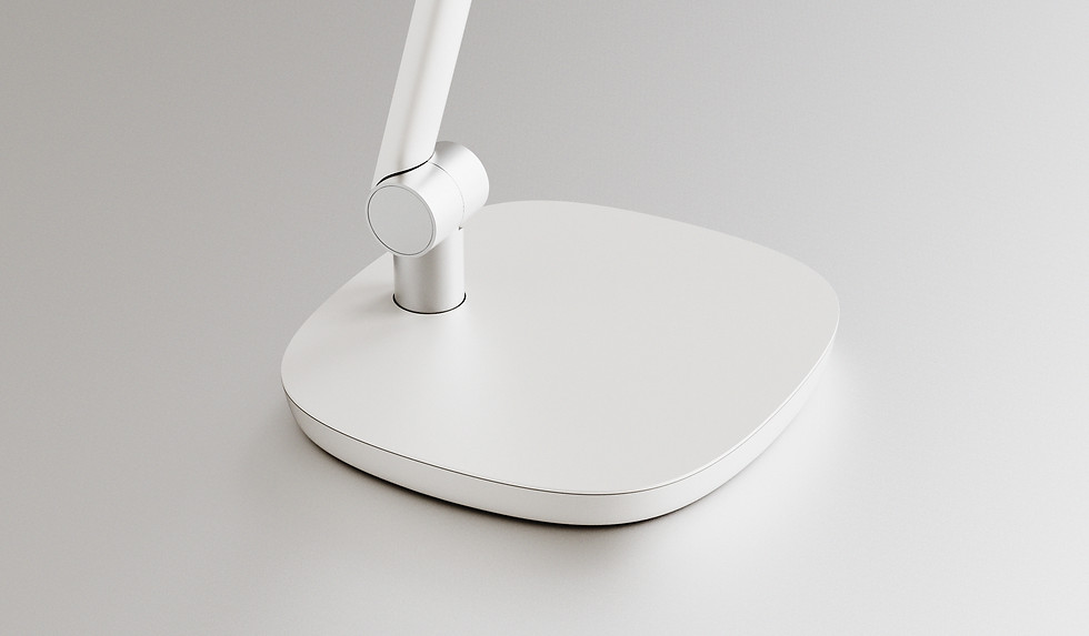
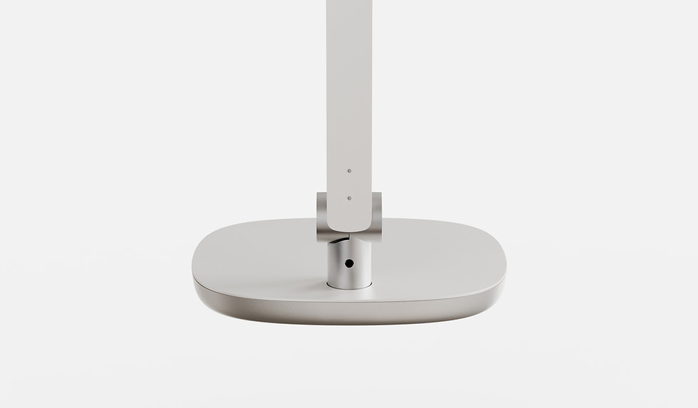
Hinges use precision die-cast aluminum with a refined matte metallic finish.
Arms use aluminium extrusions with CNC-finished ends and a matte pearl finish.
Every detail reinforces the feeling of precision.


Accessory : Freeing Up Desk Space /
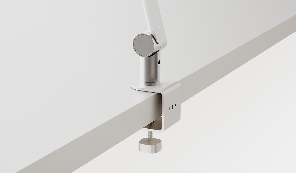
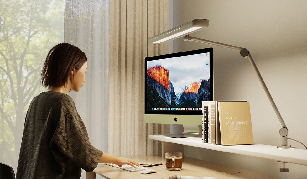
We also designed a desk clamp accessory for A9. Instead of taking up valuable desk space with a traditional base, the lamp can be securely mounted to the edge of the desk. This keeps the workspace clear, making it especially useful for smaller or busy desks. More light, less footprint.

CMF Strategy: Two Color Directions /
Based on our 2025 Color Palette Strategy, I proposed two distinct color directions for A9:
Neutral Gray / Silver: This is our mainstream direction with high market acceptance, designed to fit a wide range of consumer preferences.
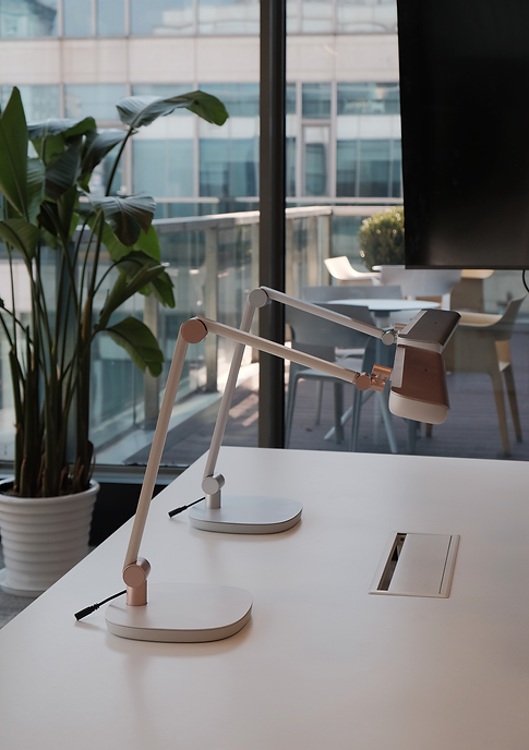
Creamy Warm White: This color expresses our core vision of blending the lamp into the user’s home. It brings a soft, warm lifestyle feeling into the living space.


From Skepticism to a Two-SKU Strategy /
We developed high-fidelity prototypes for two colour directions: the original direction and a Creamy direction. Initially, leadership was skeptical about Creamy because it was a new direction for the brand.
But once they experienced the physical prototype, the reaction changed completely.
The prototype gave the team enough confidence to move from a single-SKU launch to a two-SKU strategy, bringing both directions to market.


Protecting the Design in Mass Production /
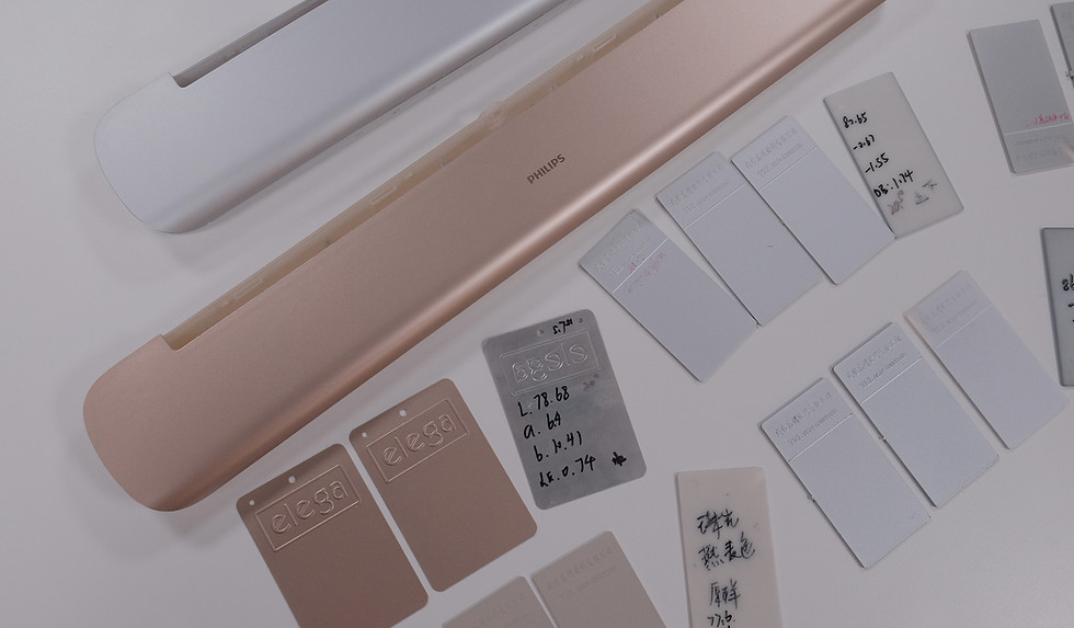
But the work didn't stop at the prototype. We worked closely with our suppliers to define CMF tolerances for colour, gloss and texture, so the design intent could be consistently reproduced in mass production.
Validating the Design in Context /
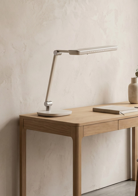
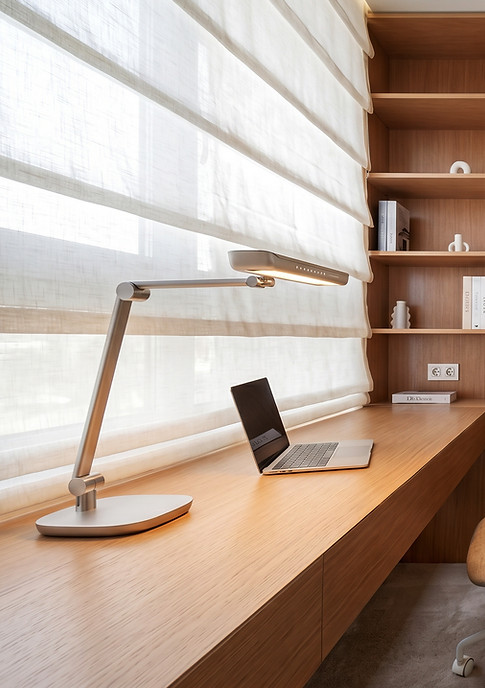
We also used Nanobanana AI to place the design into realistic home environments. This helped us evaluate something that a product render alone couldn't tell us — does the product actually feel right in the home?